
Anatomy of a Brand Kit
Your brand should bring a cohesive look and feel to your business, regardless of where your logo lives. Comarkit specializes in putting together straightforward and complete brand kits that give you a system and strategy for colors, typography, graphics, and more.
This page will show you an example of a full brand kit by giving you a sneak peak into comarkit’s very own system!
Story & Voice Guide
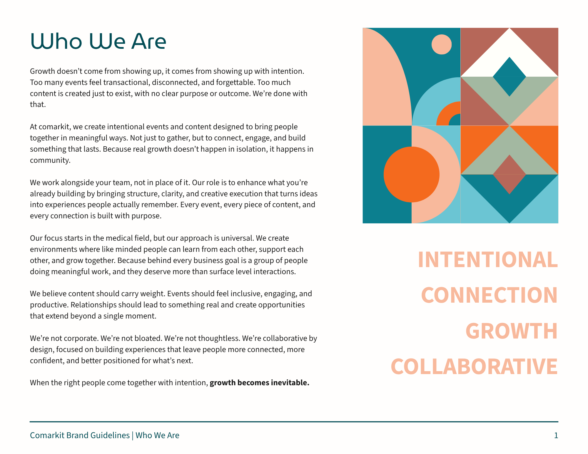
We often see this part skipped when it comes to branding, but your brand is more than just logos and colors. It’s every piece of copy that lives on your website, social media, pamphlets, ads - you name it. When someone on your team sits down to write something, the tone and voice should be referenced against your Story & Voice guide, instead of reinvented from scratch.
This is the filter for every word your brand ever publishes. Without it, your messaging drifts every time someone new writes for you. Your Story & Voice guide also give you opportunities to lean into pillars (you’ll see ours are Intentional, Connection, Growth, Collaborative) as the shorthand version of what you stand for.

Primary Logos
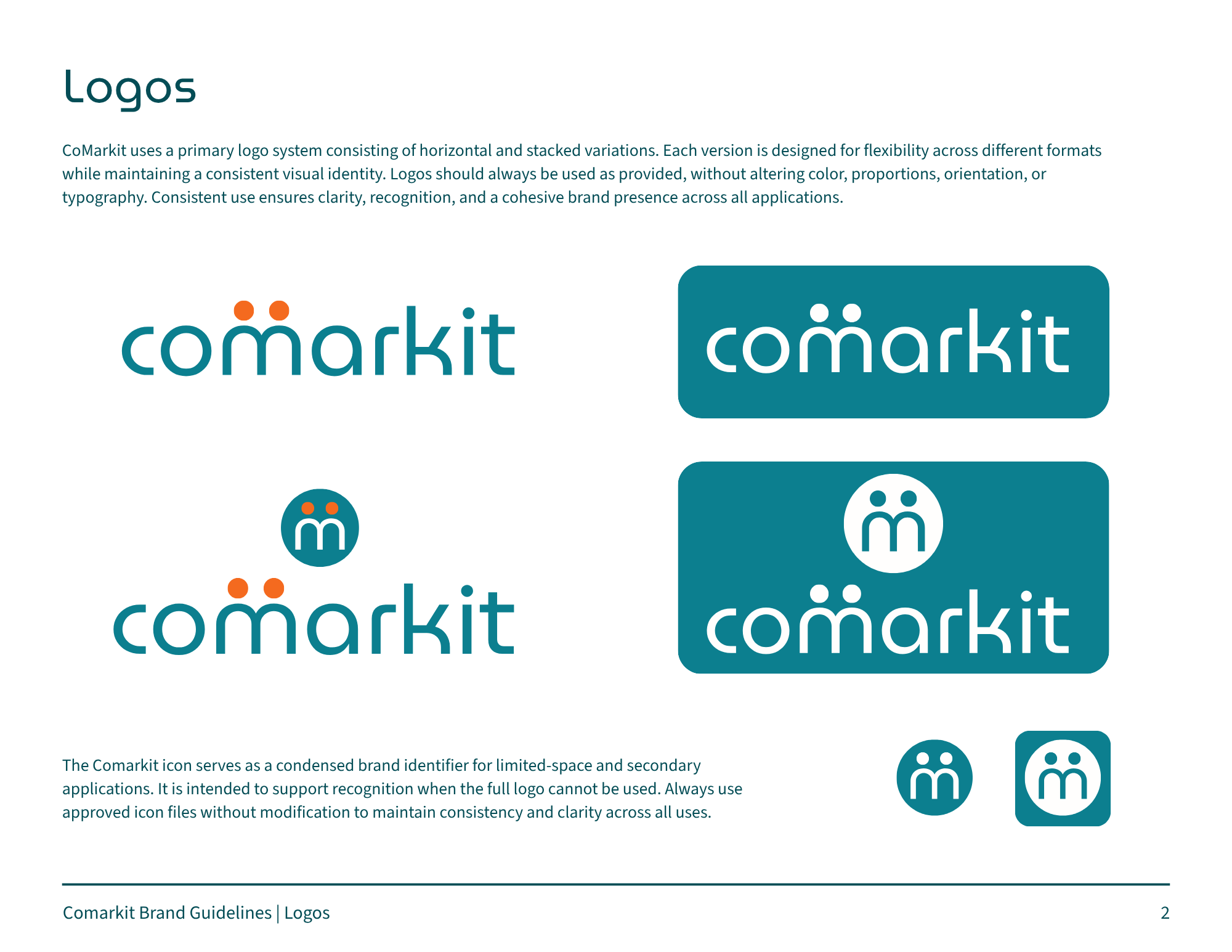
The main event - your main logos. We work on both horizontal and stacked variations because real-world formats vary. Areas like email signatures, banners, merch, square profile images - they all need different versions.
One logo isn't enough. A logo system means you never have to squish, stretch, or improvise. There's an approved version for every space, color, proportion and orientation.
Logo Variants
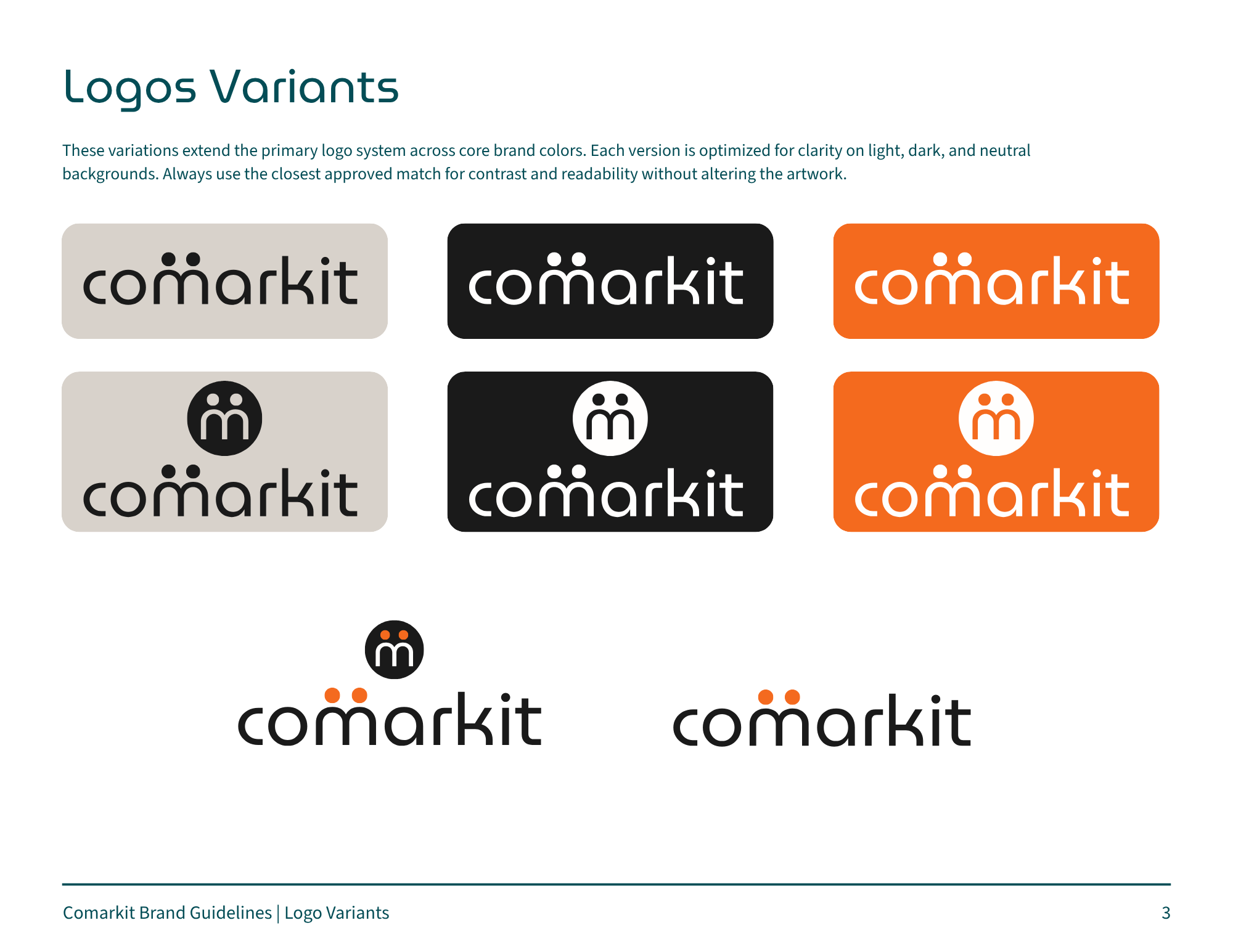
Your logo will sometimes need to live on backgrounds you can't control; dark websites, printed programs, and sponsor banners. Variants mean it's always legible and always on-brand, no matter where it lands.
We focus on giving you these variety of options so that your brand is still memorable, even when the colors have to shift.
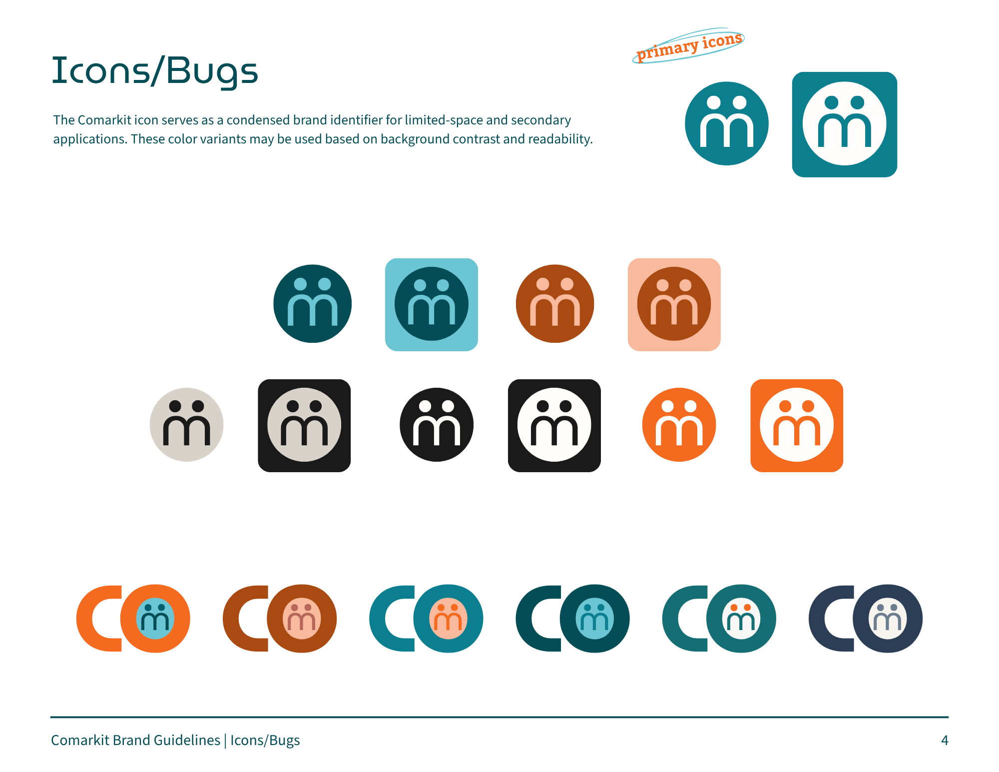
Icons & Bugs
Sometimes your brand needs a little extra something - specifically, smaller icons where a full logo would be unreadable. These icons and bugs are primarily used in apps, social avatars, watermarks, and your web browser.
These icon variations also show off more of your company’s personality and flexibility (they also make for great stickers!)
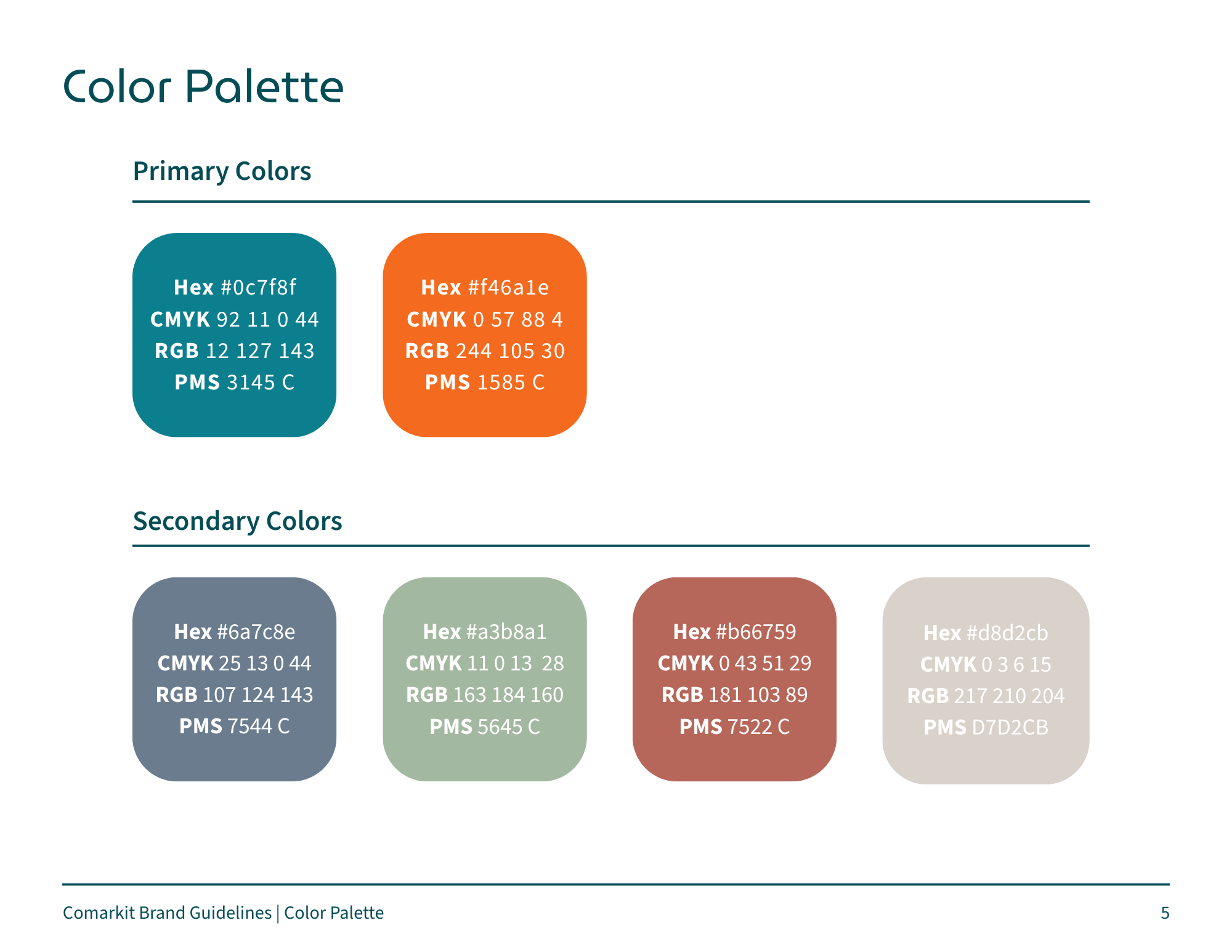
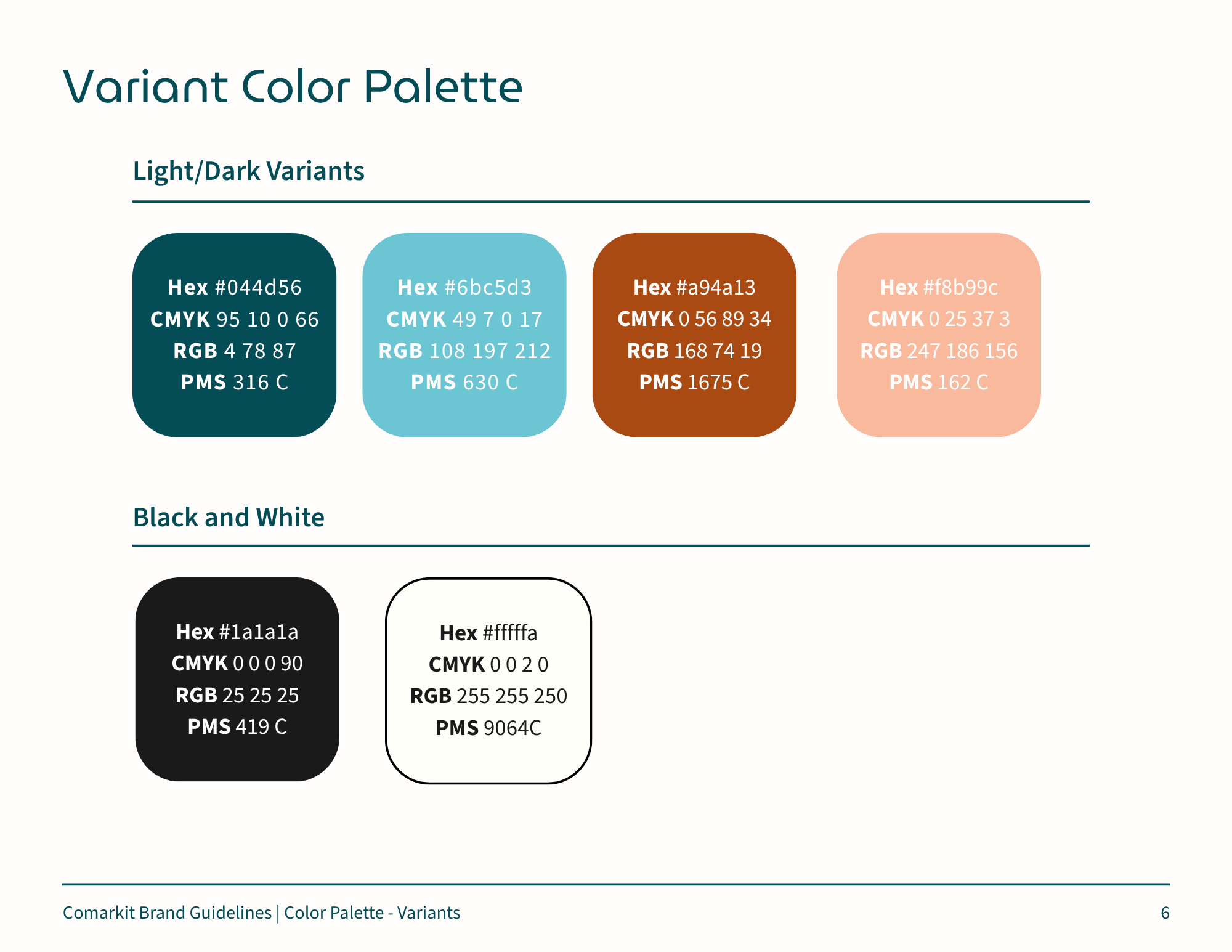
Color Palette
Your color palette comes complete with primary, secondary, light/dark variants, and specific black and white tones. This allows you to stop guessing which colors come first in priority and how to use the other colors across your marketing materials.
We put together Hex for web, CMYK for print, RGB for screens, and Pantone for professional production. Why do all these variations matter? So your colors literally translate on every medium. For example, the comarkit teal, if not formatted correctly, looks very different on a business card, billboard or browser. But when detailed out for every avenue, we can keep our brand consistency the same everywhere!
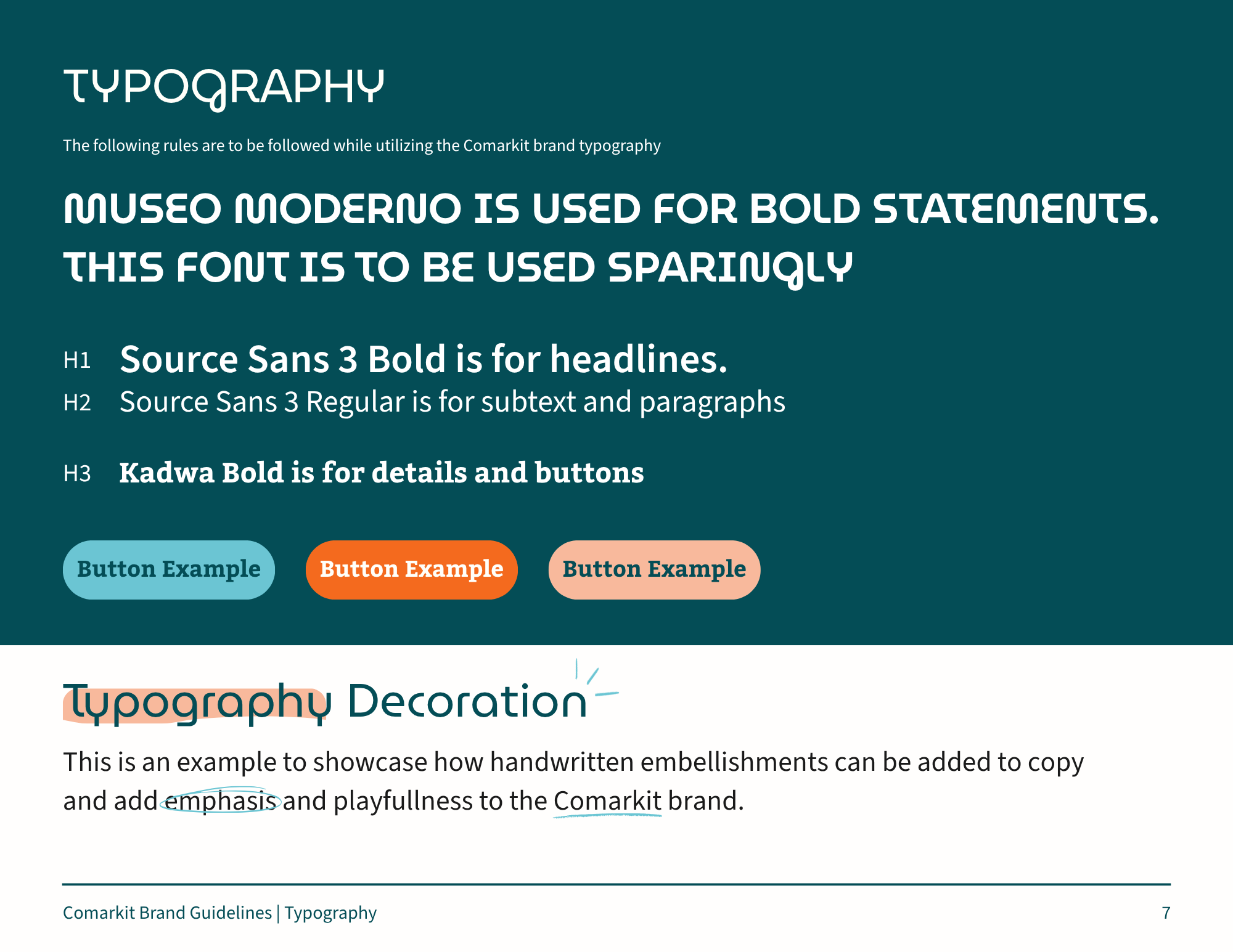
Typography
No, not everything is Helvetica or Times New Roman!
Typography puts together the hierarchy of your fonts. The headings, details, and the main copy all hold very clear jobs and rules. This is especially critical for websites where ADA compliance and Google/AI searchability is key - the wrong fonts in the wrong hierarchy can make or break your website.
And if it applies, we do offer opportunities for typography decoration, giving your brand some personality, and not just rules.
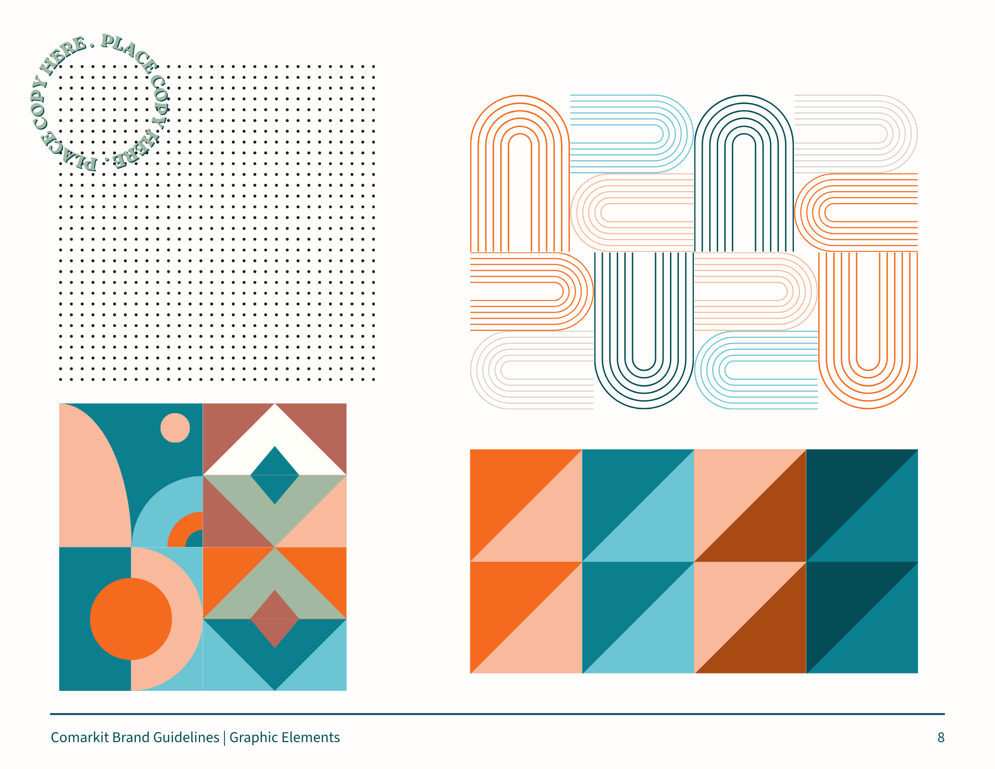
Graphic Elements
Patterns and shapes allow you to create endless branded content, without stamping your logo on everything. These elements are great for putting together social media content templates and help make your brand feel expansive and rich, instead of just repetitive.

Branding matters, and is way more than a logo.
A complete brand kit from comarkit powers your business with a full operating manual, and is the difference between memorable companies and those that get dismissed. First impressions matter more than you think. We’d love to help you make yours matter.